What Is the 2027 Color of the Year?
Plus, designers share how to use it in your home.
PHOTOS COURTESY OF PITTSBURGH PAINTS COMPANY AND GLIDDEN
What’s your favorite color?
If you tend to favor a warm, smokey blue, 2027 may just be your year.
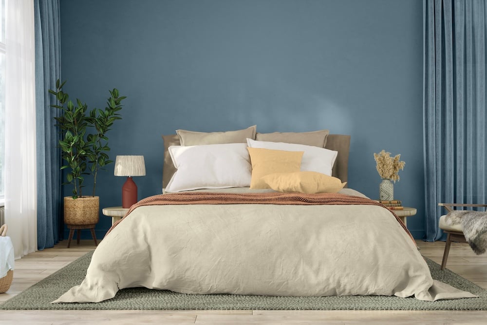
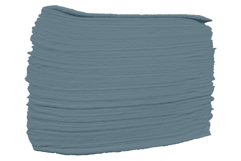
In September, Pittsburgh Paints Company and Glidden brand announced the 2027 Color of the Year: Artifact, or PPG10-16. The rich blue hue “sweeps in calming energy that adds to a room’s character or personal style,” officials say.
It is the 14th color to receive the annual honor from the Pittsburgh-based company, and it marks a distinct shift in design aesthetics; the shade moves further away from the neutral grays that dominated the pre-pandemic era, instead favoring emerging colors that feel “welcoming, personal and timeless.”
“I’m very excited about this color,” says Seashal Belldina, owner and principal designer of the South Hills-based company Interiors by Seashal, LLC.
“Blue has really become a neutral, and it’s a color requested by almost all of my clients,” she adds. “I love the vibrancy of this particular shade because it has enough depth to make a statement while still working beautifully with a wide range of complementary colors.”
Last year, Pittsburgh Paints Co. and Glidden named Warm Mahogany as the Color of the Year; in 2025, the title went to Purple Basil. Artifact joins a lineup of bold colors that designers say bring clarity without coldness — and freshness without flash — to create spaces that feel comfortable, upbeat and easy to live in.
“I think color trends are often a reflection of what people are craving in their homes and in their everyday lives,” Belldina says. “We’re seeing a continued desire for interiors that feel personal, warm and expressive rather than overly neutral or predictable.”
She adds that blue is especially versatile; it can feel calming and familiar while still bringing personality into a space.

“I think this particular shade is resonating because it has a beautiful balance — it’s vibrant enough to make an impact, but it still has the depth and versatility that make blue feel approachable,” she says. “It can be dramatic or understated depending on how you use it, which makes it a really livable color.”
That depth and versatility makes it a strong choice for a variety of rooms; from subtle cabinetry in a kitchen to “color drenching” a living room, then layering in colors like burgundy, greens or muted yellows for contrast.
According to Ashley McCollum, Glidden’s paint color marketing manager, Artifact is also perfect for DIYers who want to transform a space without starting over.
“Not every home update needs to be dramatic to feel different,” McCollum says. “Artifact is that perfect ‘hit reset’ color. Not a reinvention — just a fresh realignment. It’s fresh, optimistic and lets people design a space that reflects who they actually are, and not who they’re expected to be.”
McCollum recommends Artifact to reset high-impact surfaces, including interior walls, exteriors, ceilings, accents, doors and cabinets.
“Consumers today want color that feels like their call, not a design rule. A smoky blue like Artifact behaves like a modern ‘choose your own adventure’ color that doesn’t force a story or a specific design style onto you,” McCollum says. “It lets you shape your own story depending on what you choose to pair it with.”