These Are the Cozy Colors You’ll See in 2021
PPG Paints unveils its Color Palette of the Year, a trio of soft neutrals.
PPG Paints typically chooses its annual Color of the Year — which serves as direction and inspiration to architects, designers and homeowners in the coming year — by carefully analyzing global trends.
So in this year of a pandemic, it should come as no surprise that for 2021, PPG chose a whole color palette — not just one color as in years past — that focuses on bringing comfort to over-stimulated and weary consumers.
“With the world sheltering in place for the better half of the year, we have begun to crave human connection and embrace simple activities, including walking, hiking, baking and gardening,” says Dee Schlotter, PPG’s senior color marketing manager of architectural and industrial coatings. “This organic and hopeful palette represents what we have been longing for after decades of overstimulation and overconsumption — simplicity and restfulness.”
A trio of soft neutrals, the Be Well palette embraces the optimism felt in nature, as well as soothing nostalgia, in an era where normal is no longer — and where mental and physical well-being have become more important than ever, according to PPG.
The Colors
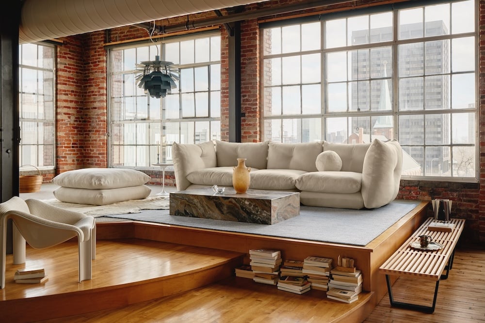
Transcend is a mid-tone oatmeal-colored hue that draws on earthy influences, grounding the palette. The opposite of the cool grays that have dominated the landscape over the last few years, it’s a cozy neutral that PPG says emulates the feeling of a warm latte on a cool morning. Big Cypress is described as a shaded ginger with persimmon undertones. Misty Aqua is a watercolor cerulean blue that provides an unexpected pop of freshness against the other two warm, earthy tones.
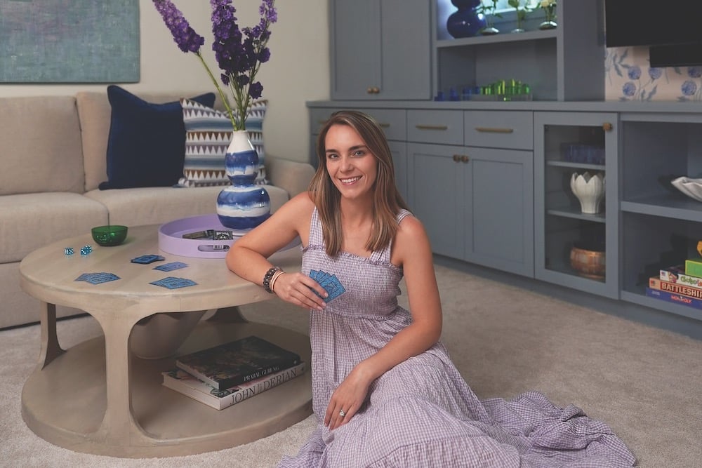
If you’re trying it at home, the collection pairs well with greenery, blonde or natural brown-toned woods and layers of texture in the form of rattan, linen, velvet and woven textiles like pillows, blankets and rugs.
“When the world experiences events that cause unrest, anxiety and grief, we tend to naturally gravitate toward compassionate colors that allow us to create a personal retreat from the world,” says Schlotter. “These comfort colors are similar to comfort foods — both offering a certain sense of familiarity and normalcy when facing the unknown.”


