Counter Culture: Inside Three Kitchen Renovations
The dream kitchen looks different depending on who’s dreaming. That idea plays out in three very different Pittsburgh-area kitchen renovations, each shaped around the people who live there and the demands of daily life.
PHOTOS BY KATELYN ROSE & ERIN KELLY
The dream kitchen looks different depending on who’s dreaming. That idea plays out in three very different Pittsburgh-area kitchen renovations, each shaped around the people who live there and the demands of daily life.
River Rails:
Reframe the View
Designer Alisha Gwen of Alisha Gwen Interior Design reoriented a longtime family home toward the landscape beyond it, opening the kitchen to a sweeping river view.
For 25 years, the kitchen in Gwen’s aunt and uncle’s home sat at the front of the house, while the view they loved most stretched across the back. The couple built the house when their three children were young, using a plan they found in a magazine. A laundry room separated the kitchen from the great room, leaving only a narrow passage between them. Family dinners and ballgames often meant gathering in separate rooms, while the laundry sat far from the upstairs bedrooms.
As the family changed, so did the way they wanted to use the house. The children grew up, grandchildren arrived, and Gwen’s aunt wanted to cook while remaining part of the action and enjoying the river.
“The minute the wall between the kitchen and family room came down, it was like a breath of fresh air,” says Gwen.
Gwen moved the main kitchen to the rear of the house, opening it to both the great room and the river. The former kitchen became a workstation space for coffee, secondary appliances, food prep and dishes.
Although Gwen describes herself as “typically anti-open floor plan,” she wanted the larger space to retain a sense of architecture. Dark-stained beams define the great room and dining area, while shiplap and a blue-painted ceiling give the kitchen its own identity. The color was inspired by the blue porch ceilings at The Greenbrier, a favorite destination of her aunt and uncle. The palette began with a coral, navy and pale-blue drapery fabric. “I schemed the entire open living/kitchen area off of this one fabric,” Gwen says.
A tricky window on the range wall led to one of the room’s most personal details: a shallow display shelf and window seat with space for the dog bowls underneath. Her aunt and grandchildren now sit there looking out at the river.
“I knew exactly what needed to be done to make this house what it should have always been,” Gwen says.
Mission Drive:
A Study in Contrast
At Babb & Mack, co-owner and principal designer Dana Mackey found a spirited middle ground between an artist’s instinct for color and her husband’s preference for restraint. The kitchen on Mission Drive already had a workable layout and cabinetry worth keeping. Mackey’s challenge was to give it a stronger point of view and make it feel connected to the family living there.
Mackey describes the project as an “intense refresh.” The cabinets remained, but ornate crown molding gave way to a simpler profile, while the floors, finishes and furnishings were reconsidered.
The homeowners brought two distinct sensibilities to the project. One is a multimedia artist drawn to color, pattern and eclectic pieces; her husband prefers richer materials and a more restrained, tailored look. “Mid-century design is really how we brought those two aesthetics together,” Mackey says.
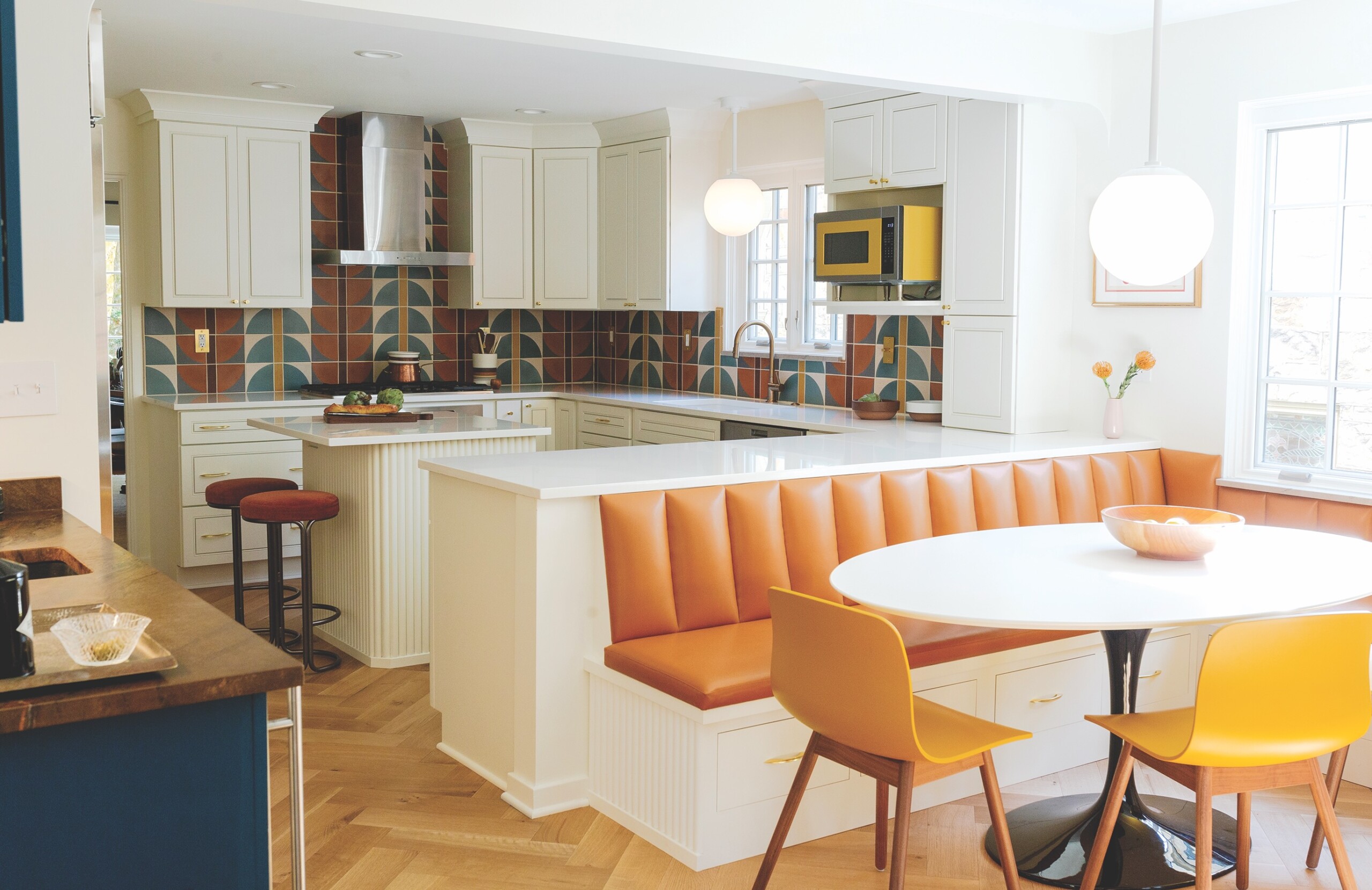
Herringbone white oak replaced the large-format floor tile, while a Claystreet stoneware vessel the couple already owned helped establish the palette. Its boldest expression is the backsplash, a graphic combination of Pratt + Larson and Kat & Roger tile.
The backsplash also had to hold its own against the adjoining family room’s substantial stone fireplace.“That fireplace is a very visually heavy element,” Mackey says. “We needed something that would feel visually balanced with the fireplace.”
Color continues through yellow molded chairs, terracotta-toned stools and an orange faux-leather banquette with storage beneath the seats.
Mackey also turned an awkward structural post into an organizing device. A new wall incorporates a shallow utility closet on one side and a custom walnut desk nook on the other, giving parents and children a place to work while staying connected to the room. The changes gave the family places to cook, gather, work and retreat within the same open space. “We’ve created very intentional areas that are identifiable by tasks, without losing the sense of one shared space,” Mackey says.
Bebout Road:
Smaller Kitchen, Smarter Plan
When the owners of this Venetia home began planning their renovation, they wondered whether the kitchen needed to become larger for better functionality. Kostanich found the solution by making it slightly smaller.
Laura Kostanich, owner of Studio S Interior Design, combined part of the kitchen with space from the hallway behind it to create a scullery for food prep, small appliances and cleanup. “They’re a really busy family,” Kostanich says. “We had to think about things like their morning routines, homework, cooking, entertaining, groceries, cleaning up, all of the things.”
The arrangement allows the main kitchen to stay clear during everyday life and while entertaining, making careful planning of the remaining cabinetry essential.
Kostanich calls the large painted island the kitchen’s “workhorse.” It stores pots and pans, incorporates a beverage refrigerator and serves as the family’s everyday gathering place. Its orientation even reflects the children’s habit of sitting there to watch television in the morning.
Warm wood cabinetry wraps the perimeter. Kostanich enlarged the windows above the sink to strengthen the connection to the backyard and added wood beams that echo the cabinetry and flooring. Vintage Italian lights, rewired for the project, hang above the island.
The range wall provides the room’s strongest focal point. Visible almost immediately from the front door, a deep navy range sits beneath a custom hood with a pronounced cornice and gently curved profile. Kostanich and her team mocked up the hood in cardboard before settling on its final proportions. “Every curve and every line that you see was very considered,” she says.
The homeowners wanted the room to feel at home in the house and age well with it.
“We didn’t want it to feel too specific to a trend,” Kostanich says. “We wanted it to feel timeless.”